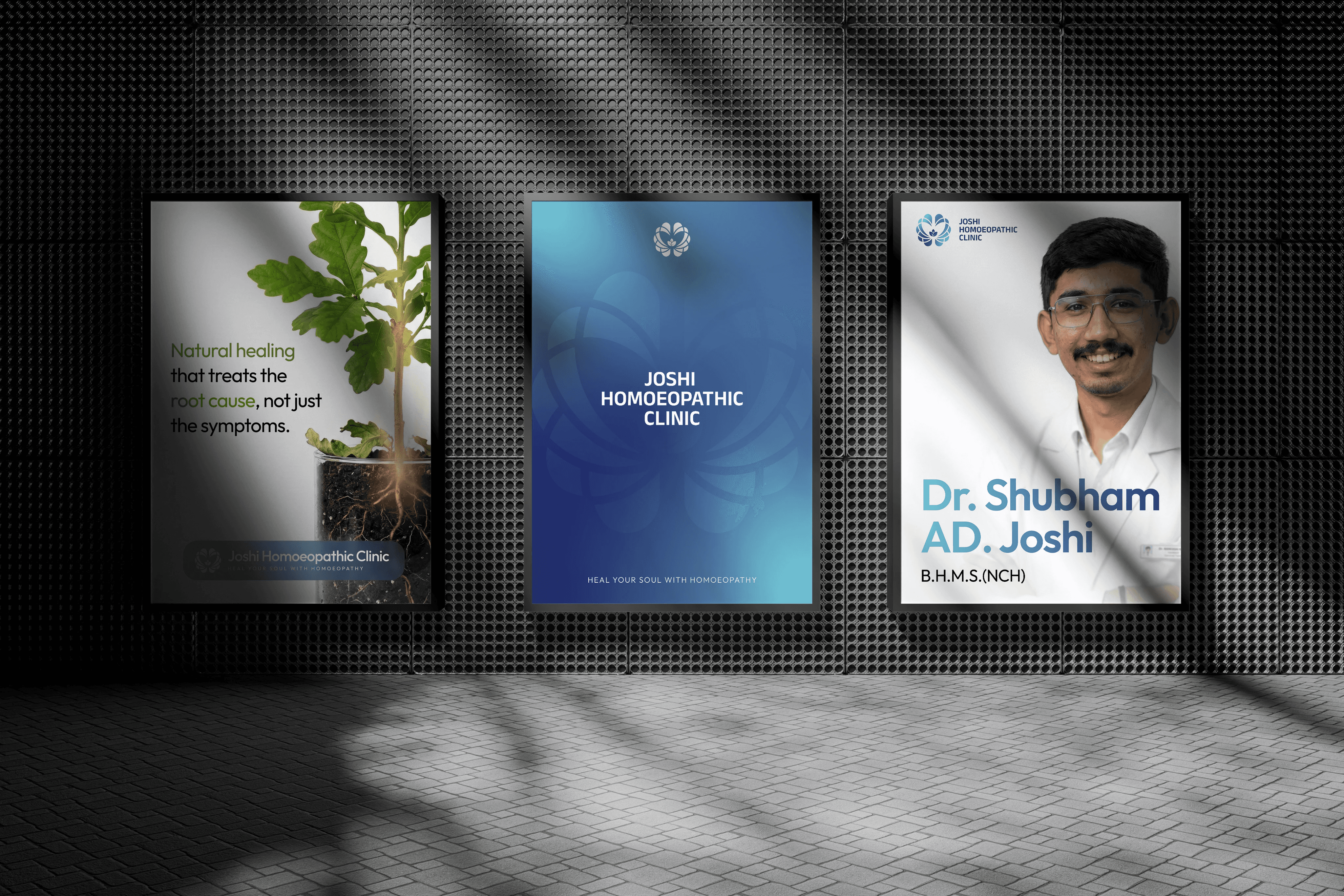
Joshi Homoeopathic Clinic — Rebranding & Identity
Client
Dr. Shubham Joshi
Scope
Rebranding, Brand Identity, Logo Design, Visual Direction, Stationery Design
Joshi Homoeopathic Clinic had an existing identity that used several literal medical elements, including anatomical references, medicine-related symbols and multiple typographic styles. While these elements communicated healthcare, together they made the brand feel visually complicated and less distinctive.
My approach was to simplify the identity and create a symbol with deeper meaning rather than showing every idea directly. The outer structure takes inspiration from the form of the brain, connecting to the clinic’s psychological focus, while the internal shapes gradually transform into petals to introduce a sense of growth and natural healing.
At the centre, a simplified seed and water-drop form represents the idea of healing, care and development. When the full symbol is viewed together, the symmetry also creates a subtle butterfly-like form, adding another layer of meaning around transformation and positive change.
The visual system was completed with a cleaner cyan-to-blue palette and straightforward typography to make the clinic feel calm, modern and trustworthy. The final identity is simpler, more memorable and easier to apply consistently across stationery, clinic communication and other brand touchpoints.